5 Simple Design Tips to Instantly Transform Your Documents
Are you frustrated with how your documents, presentations, or projects turn out, despite using tools like Canva, Word, or Adobe? Don’t worry, you’re not alone. Many people struggle to create cohesive, professional-looking designs without formal training in graphic design. But the good news is, with just a few simple rules, you can make your documents stand out — without spending years in design school! At Zoe's Ink Designs, we’re all about making design easy and accessible for everyone. Whether you're a teacher creating worksheets, a student working on a paper, or someone looking to improve their Canva game, these tips are for you.
5/8/20243 min read
1. Be Consistent with Your Design Rules
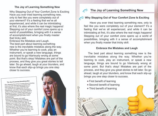
Consistency is key when it comes to creating professional-looking documents. It's easy to get carried away with fonts and styles, but if you want your design to be readable and cohesive, keep things uniform.
Tip: Once you set your design rules (like fonts, sizes, and spacing), stick with them throughout your document. For example:
Heading 1 could always be 24pt, bold, and in a specific color.
Body text should be 12pt, aligned, and in a single font family.
By being consistent, your document will flow naturally and feel structured, which is exactly what your audience wants.
2. Limit the Number of Fonts You Use
Using too many fonts is one of the most common mistakes people make when designing documents. While it’s tempting to experiment, overdoing it can make your work look messy and unprofessional.
Tip: Stick to no more than three fonts:
One for headings,
One for subheadings,
And one for body text.
Choose easy-to-read fonts that fit your audience and the tone of your document. For example, sans-serif fonts like Arial or Roboto are great for professional reports, while something playful like Comic Sans could work for a children's project (but use it sparingly!).
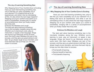
3. Focus on Alignment and Spacing
Proper alignment can make or break your design. It's what gives your document structure and balance, making it easier to read and visually pleasing. Misalignment, on the other hand, can distract and confuse your audience.
Tip: Make sure to:
Align all your text properly (justify or left-aligned is usually best for large chunks of text).
Ensure even spacing between paragraphs and sections.
Use consistent margins around your page.
Spacing also helps your design breathe and not feel cluttered. Don't be afraid to use white space!
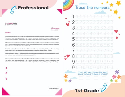
4. Choose the Right Colors
Colors are a powerful design tool, but only if used correctly. Too many colors can overwhelm your audience, while the right balance can make your design pop.
Tip:
Stick to two or three complementary colors.
Use one as your main color and the others as accents.
Not sure which colors go well together? Tools like Canva’s color wheel can help you find the perfect combination!


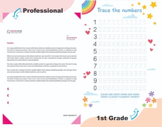
5. Know Your Goal (And Your Audience)
Before you dive into designing, think about who will be reading or viewing your document and what the purpose is. Are you trying to create a fun, engaging worksheet for kids, or is this a professional report for a board meeting?
Tip: Always have the end goal in mind:
For professional documents, keep things clean and simple.
For creative projects, you can experiment more, but always stay within the boundaries of good design principles.
Make Your Designs Work for You!
By following these simple tips, you’ll be able to create documents that not only look good but also communicate clearly and effectively. Whether you're new to design or just want to improve, remember that it's all about making small, intentional choices. Consistency, simplicity, and a clear goal will make your designs stand out!
And if you ever need help or feel like you’re running out of time, don’t hesitate to let me do it for you! At Zoe’s Ink Designs, we’re here to help you design stunning, professional documents with ease.


Diseño gráfico básico